Metus vitae pharetra auctor
Lorem ipsum dolor sit amet, consectetur adipiscing elit. Integer nec odio. Praesent libero. Sed cursus ante dapibus diam. Sed nisi. Nulla quis sem at nibh elementum imperdiet. Duis sagittis ipsum.…
Lorem ipsum dolor sit amet, consectetur adipiscing elit. Integer nec odio. Praesent libero. Sed cursus ante dapibus diam. Sed nisi. Nulla quis sem at nibh elementum imperdiet. Duis sagittis ipsum.…
Lorem ipsum dolor sit amet, consectetur adipiscing elit. Integer nec odio. Praesent libero. Sed cursus ante dapibus diam. Sed nisi. Nulla quis sem at nibh elementum imperdiet. Duis sagittis ipsum.…
Lorem ipsum dolor sit amet, consectetur adipiscing elit. Integer nec odio. Praesent libero. Sed cursus ante dapibus diam. Sed nisi. Nulla quis sem at nibh elementum imperdiet. Duis sagittis ipsum.…
The senior management team centralized AMER, EMEA, and APAP regional digital design team into a global team. The idea was to create an aligned, maximum functioning team, and resources for different teams in the company.
The merged digital design team has 18 people in total. The senior management team created a global distribution list globalDigitalDesign@xxx.com in the Outlook for all stakeholders to send their project requests. The team members were heavily relied on Outlook to manage projects.
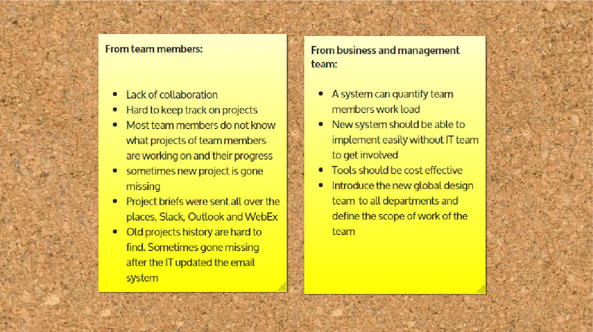
However, the distribution list becomes a nightmare for the team for the below reasons:
After a few months of struggle, we gave feedback to the senior management team, and they acknowledged the problem and asked for our solution.
I then worked with two team members (copywriter & back-end developer) and team director to write a business plan.
We gathered all the feedbacks with the current workflow, organised the team’s information regarding their expectations on the new system. At the same time, find out the business/management objective.
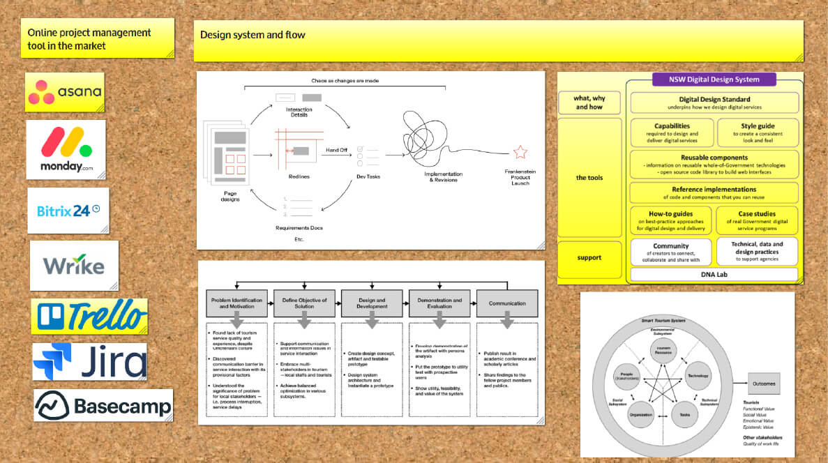
We then researched what project management tools were available in the market and investigated what system & flow of digital design firms are using.
We find the ticket system is suitable for the team, but we think implementing a ticketing system is not good enough. We want to have a holistic approach. Thus, we come out with the below plan:
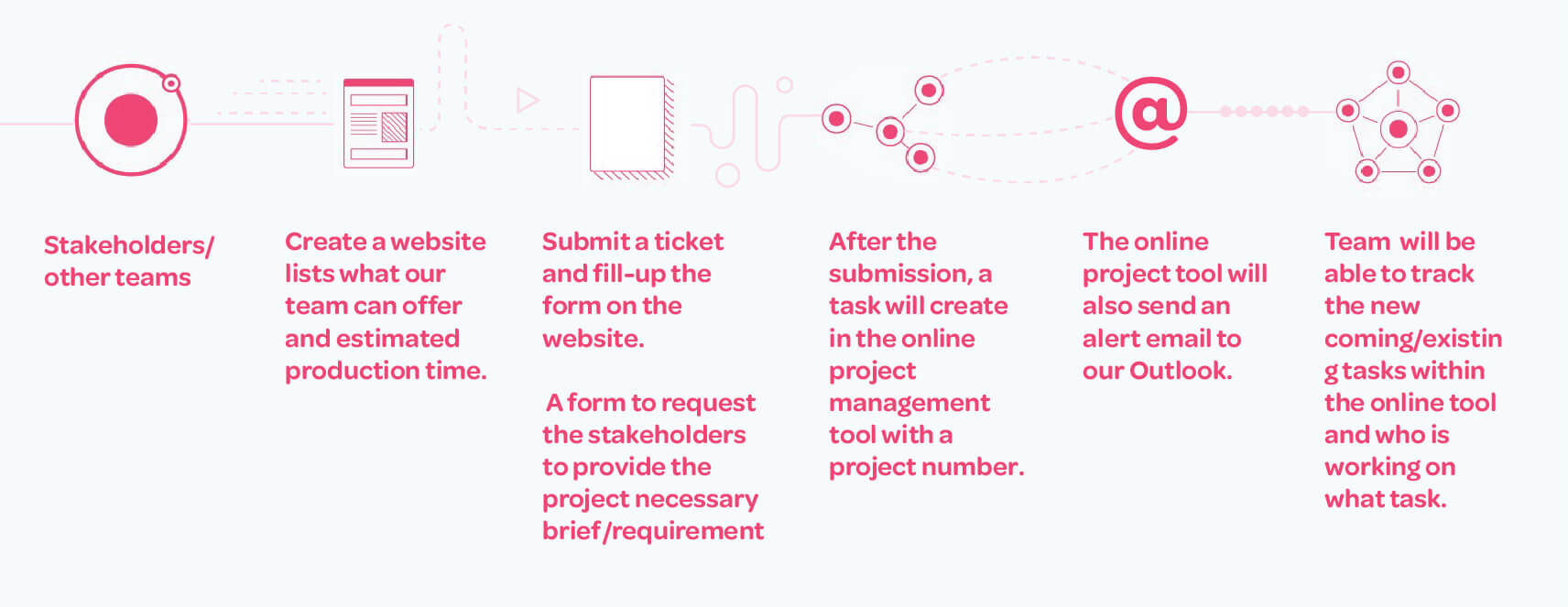
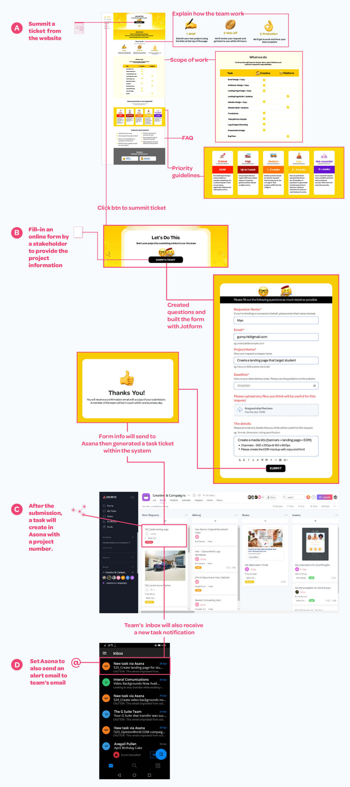
Tableau report had shown the website member’s productivity consistently declining since the COVIOD-19 outbreak from Jan- Mar 2020. We think it could be a bit sensitive to send emails to members during this period.
We believe it would be better to send a communication email with infographics and data related to COVID-19, then included only one subtle Call-To-Action button at the end of the email.
In this project, I worked with a campaign manager and a copyrighter. My role in this project was to assist with strategy, create email mockup & Html, test and send emails, and monitor the data to optimise the email.
There’s a time that people were panic buying toilet paper. The news was broadcast on different media and draw much attention. We designed a mini poll survey on websites and asked members about the impact of COVID-19. We also asked what they think about the panic toilet paper behavior on the sites (AU, UK, and the US).
The tone of the email is informative and condolence rather than action and sale-oriented.
I think for this type of email, it would be better to use two columns. For a design perspective, I use illustration and responsive design approach.
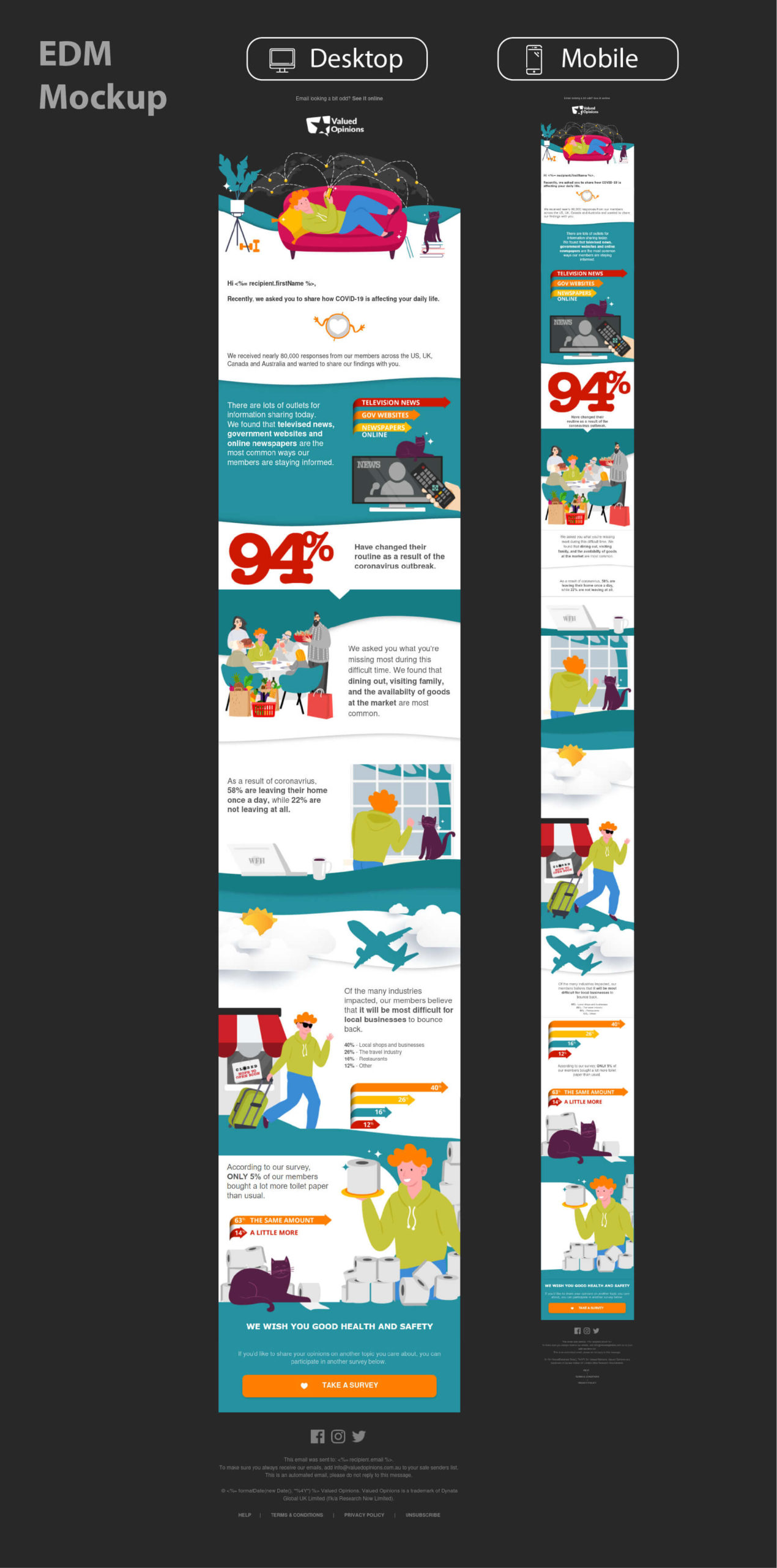
Start coding after sign off from the campaign manager.
There are hundreds of email rendering clients (Desktop, web, and Andriod/ISO) in the market. It is almost impossible to check them one by one. Thus, I utilise EmailOnAcid to make sure the responsive email looks great on most email clients.
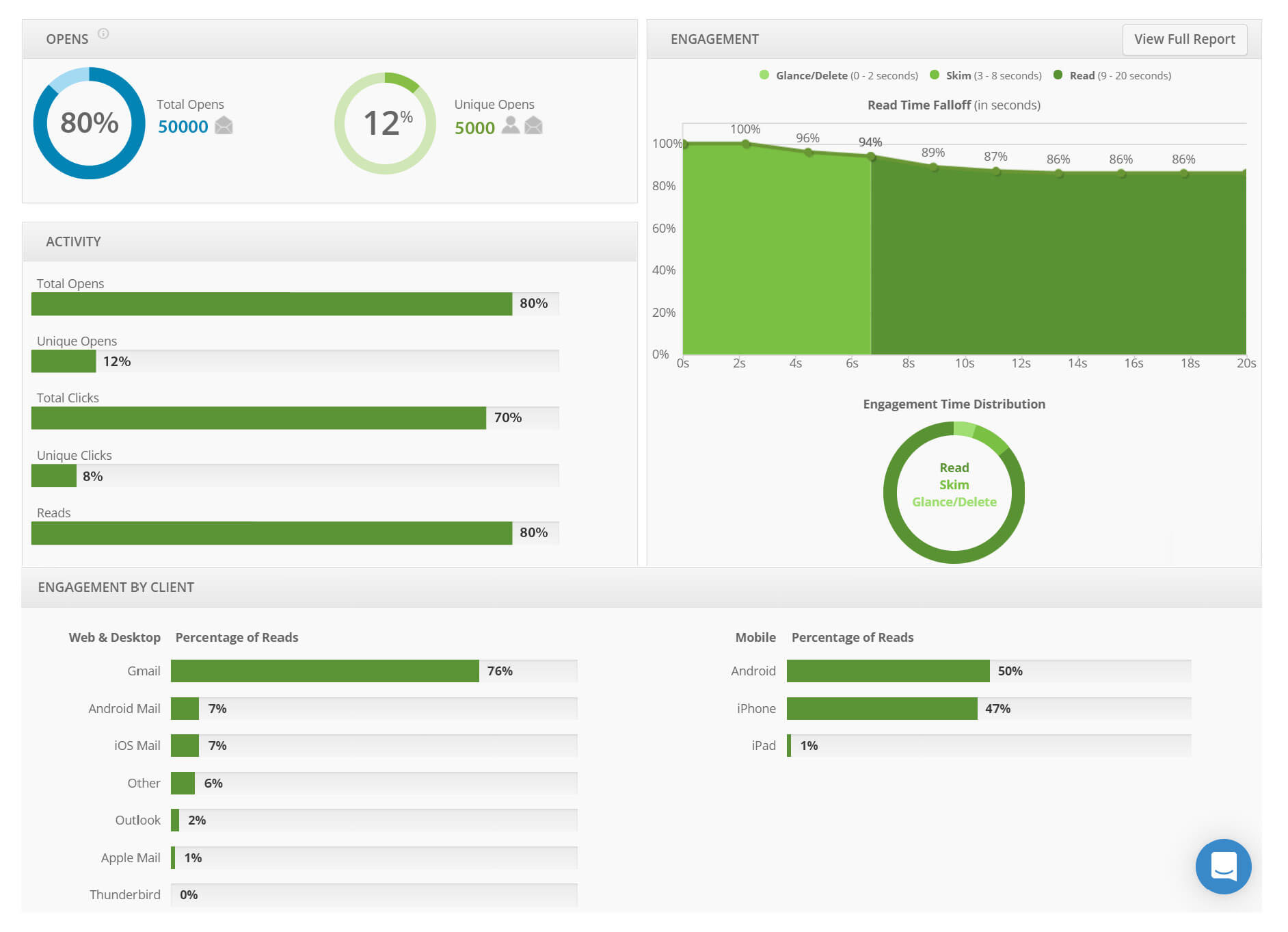
After carefully check the email, I then implement the analytic code. The analytic code will prove many useful data such as open/click/engagement rate, what type of device to view the email, heatmap, etc… The data helps me to learn how members reacted with the email.
The company used the system calls DubKnowledge to store all the members’ data. I then created the unique code tags from the system and applied them to the email. The email included many unique code tags such as salutations, redirect/unsubscription link, contact helpdesk links, unique Call-To-Action links, etc. I will test emails from the Adobe campaign and ensure those unique code tags are displayed properly.
The final step is based on the campaign manager’s target to send the emails. For this project, the target is to send email to 1,000,000 members in AU, UK, and the US. I then segmented the audience and scheduled daily send targets in Adobe campaign.
I always proactively check the analytic data after the email was sent. The data helps us to understand how the members engage with the EDM. I will suggest the team to optimise the EDM with the problem areas.
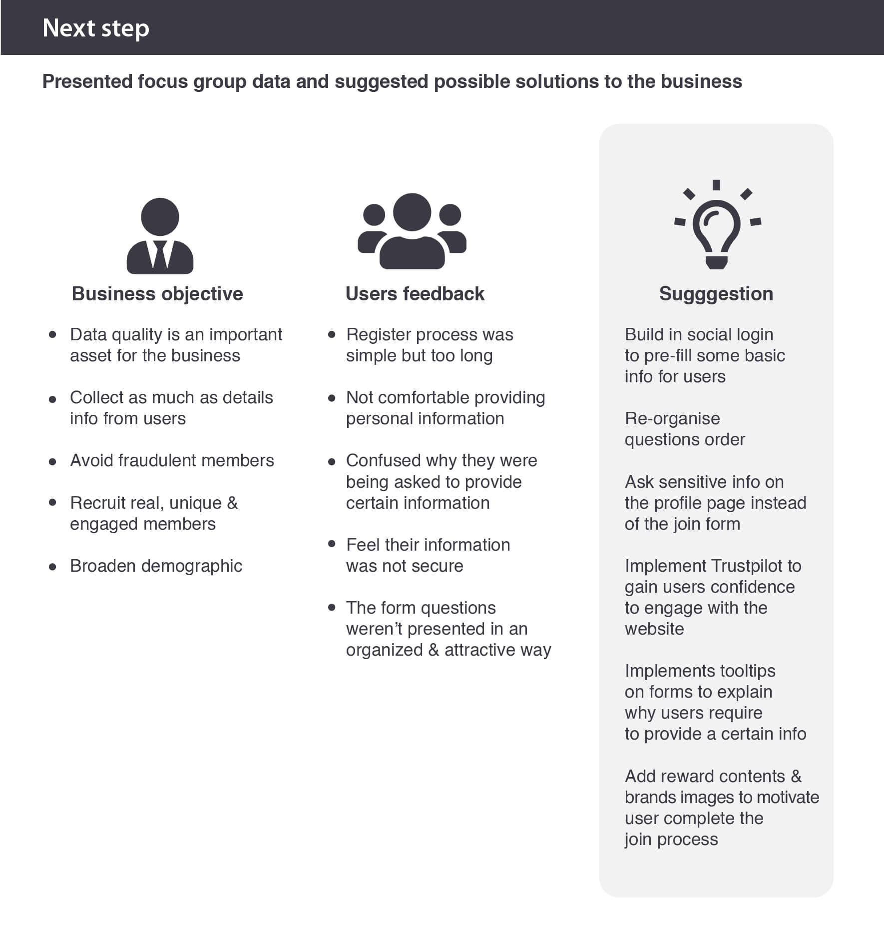
The data insight team reported one of the core websites join flow conversion rate is constantly dropping down as there is no error within the join either on desktop and mobile. The business would like to find out the reason why this happened.
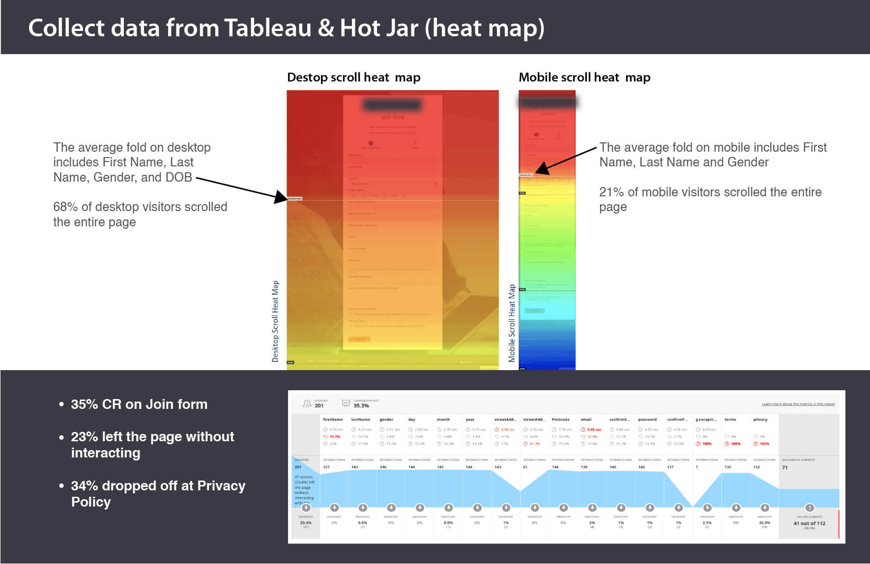
This was a collaborative project. My role in this project was to implement tracking code, collected data from Tableau & Hotjar, participated meetings to map out the focus group components and worked with the help-desk team, and sent out communication materials to members.
1. Implemented a Hotjar code on the pages so we would have some background data on how people reacted with the join pages.
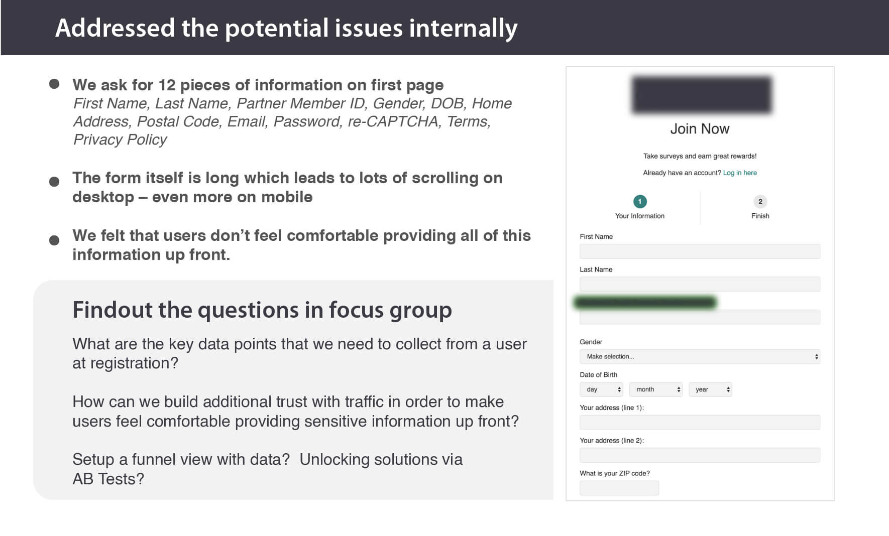
2. Internally revisited the whole join flow pages and addressed the areas that could be improved and map out the focus group components.
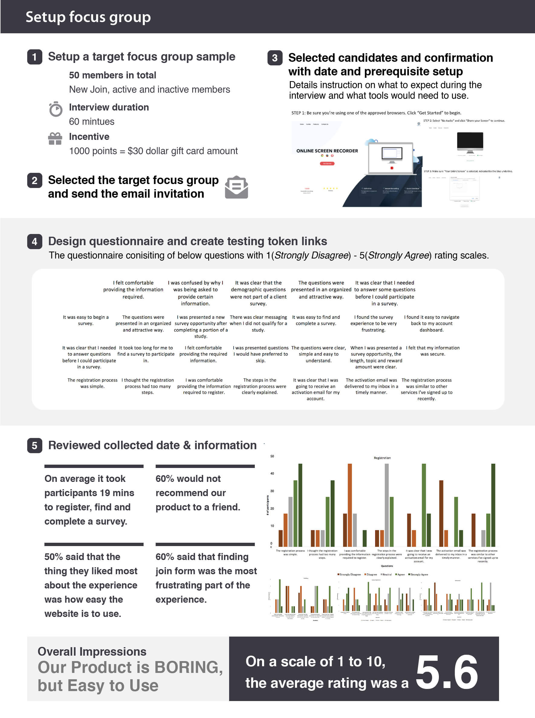
 3. Created a focus group and invited various members to join the focus group. Participants were asked to register on the website. During the exercise, we requested the participants to record their experience.
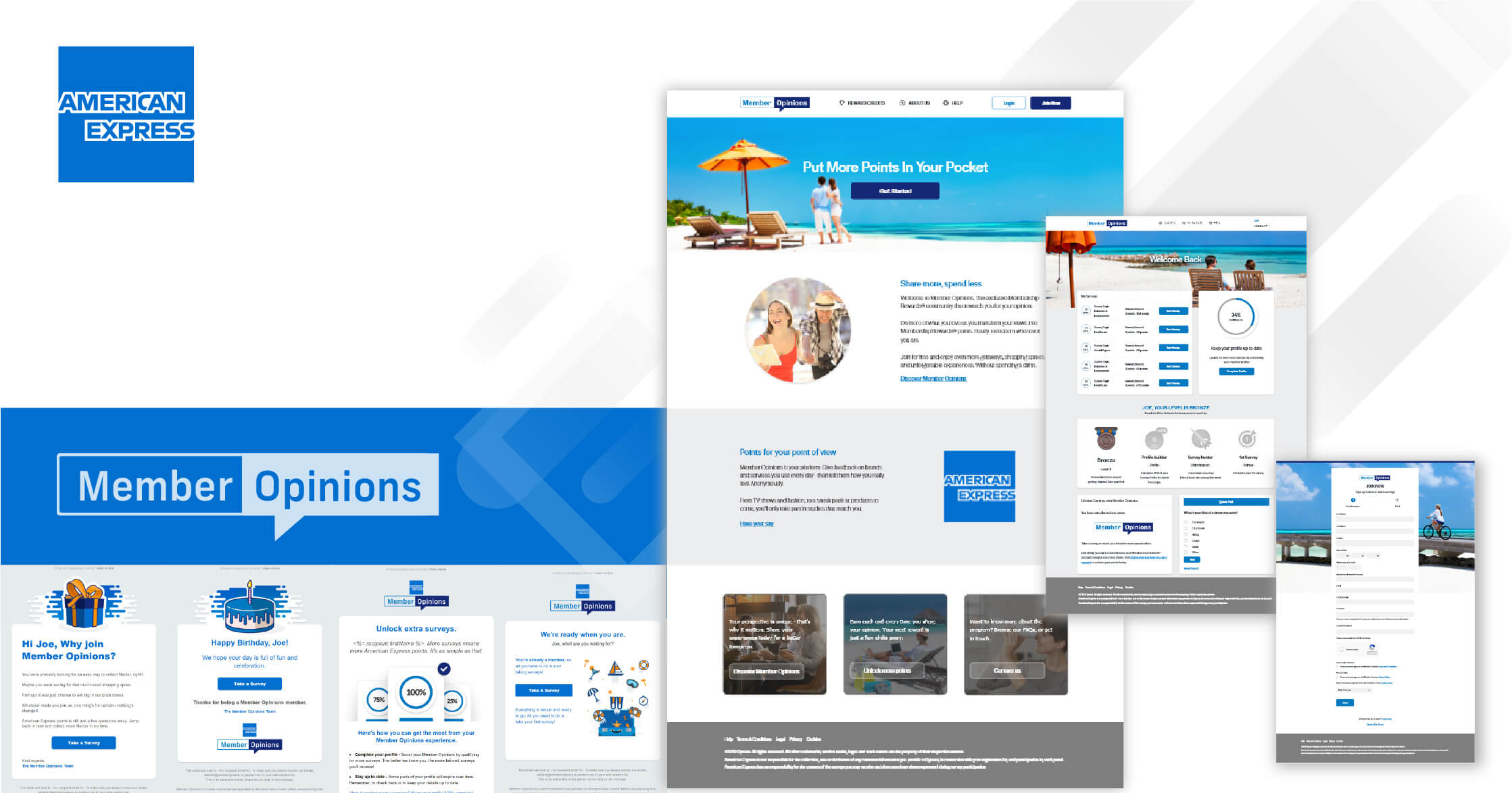
Membership Rewards® is the loyalty program for American Express(AE) credit card members. AE members earn Membership Rewards® points when they use their American Express cards. These points can be redeemed for a wide variety of travel rewards, shopping rewards, and entertainment rewards.
By building a partnership loyalty program with AE can enrich the company panel sample and data size as there are more than 10 million active members with Membership Rewards®.
Building a brand new B2B loyalty panel is a very complex project. This involves multiple function teams to work together diligently to deliver this project. According to the contract, we would need to deliver the whole project within two months.
In this project, I worked with a key stakeholder (partnership team) and a copywriter in my digital product team. My role in this project is not only to deliver mock-ups (branding, web-pages, landing page, EDMs, system pages & recruitment materials) but also built and implemented them into the different systems, debug with the System, QA, and IT team when testing the whole flow and supporting the soft launch.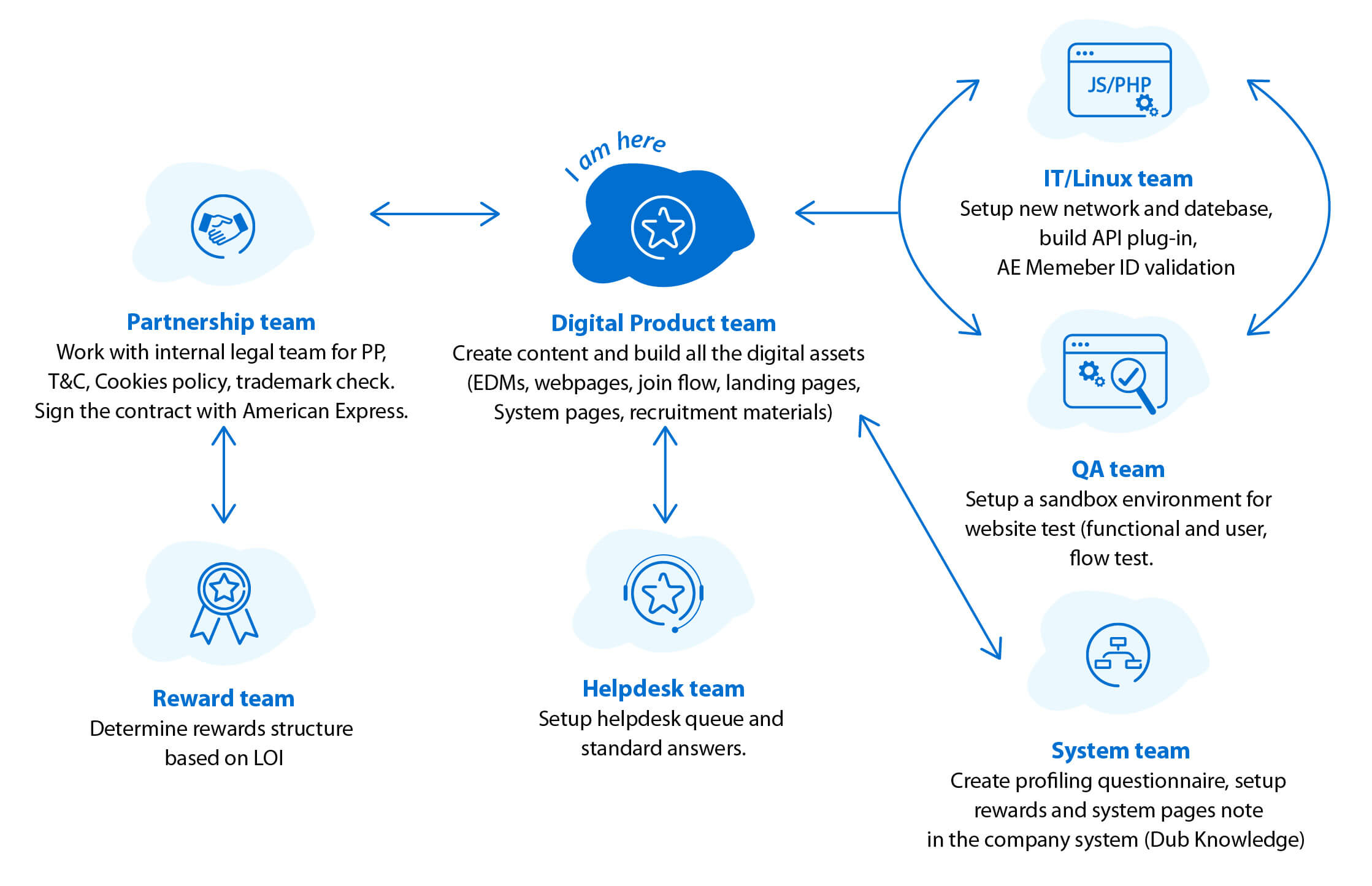
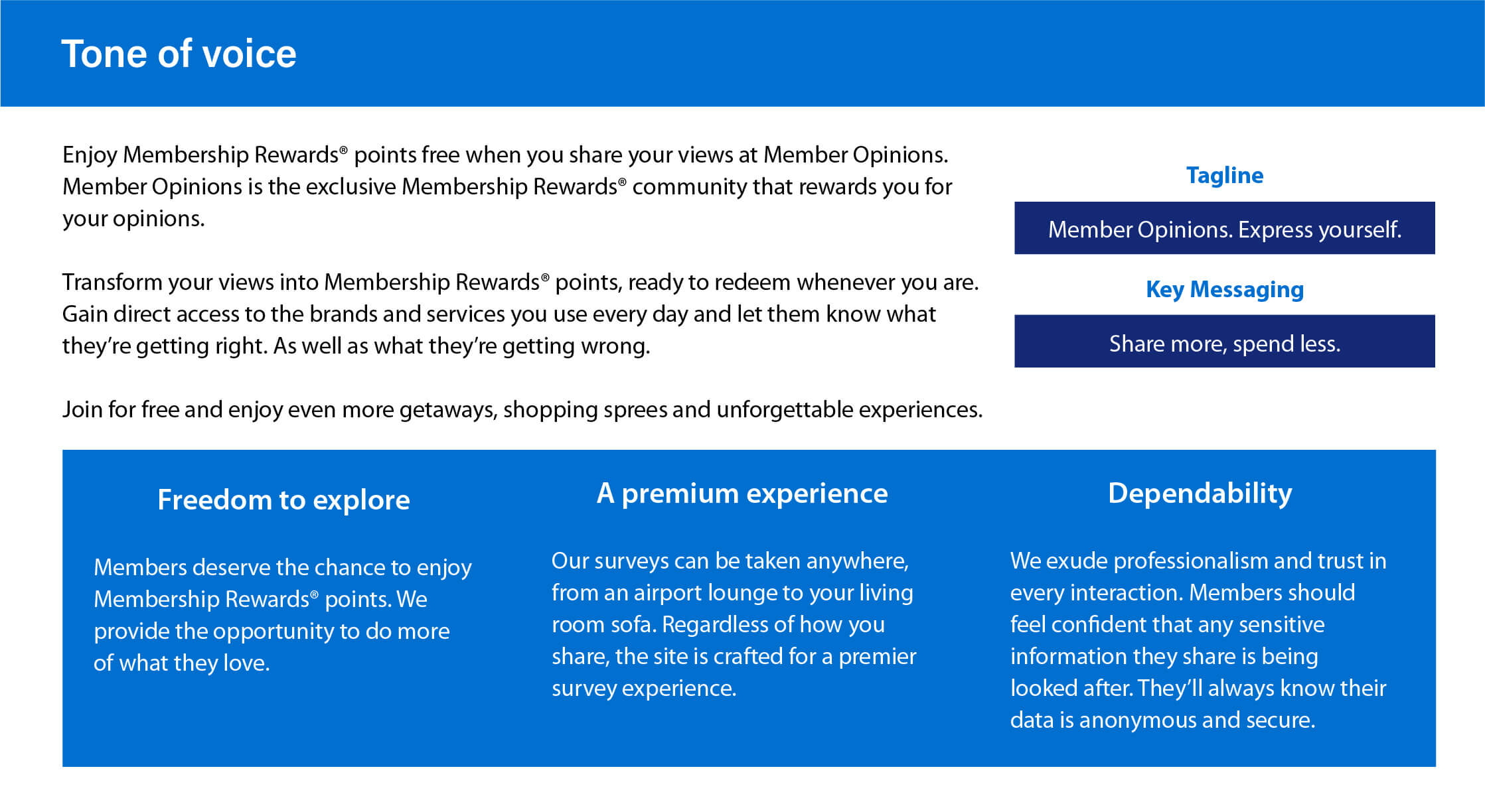
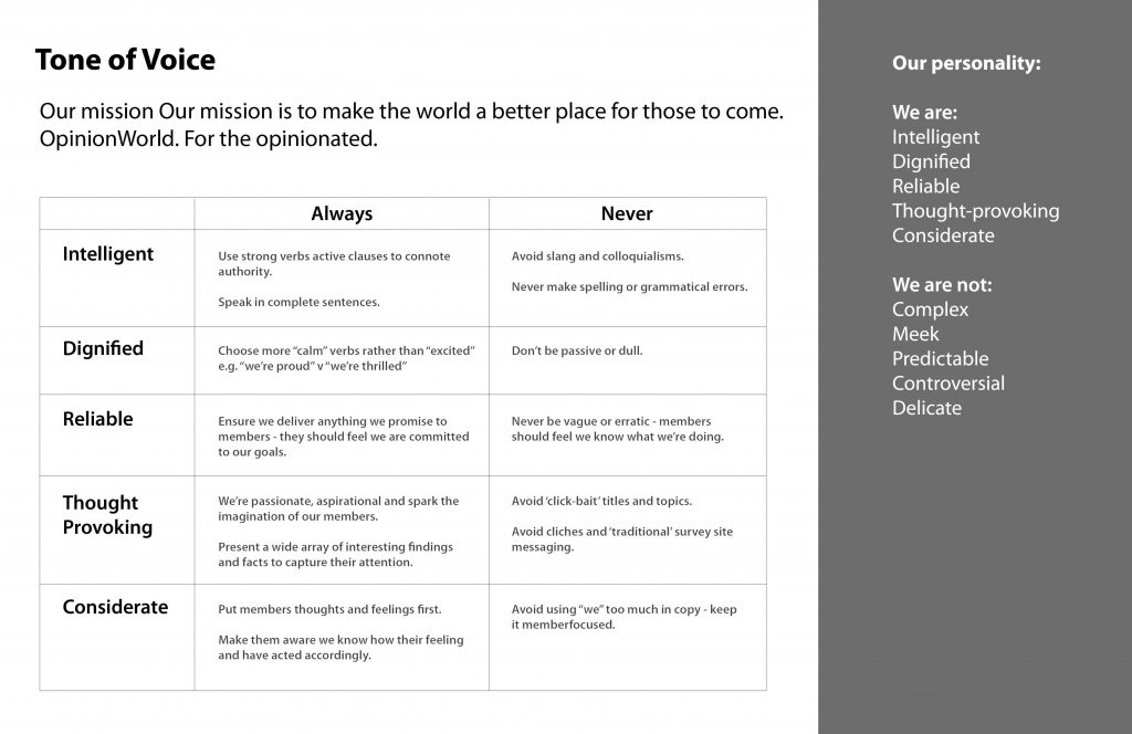
Like other branding projects, it is important to set the tone of voice beforehand. I worked with a very talented copywriter in my team to shape this cornerstone of this project.
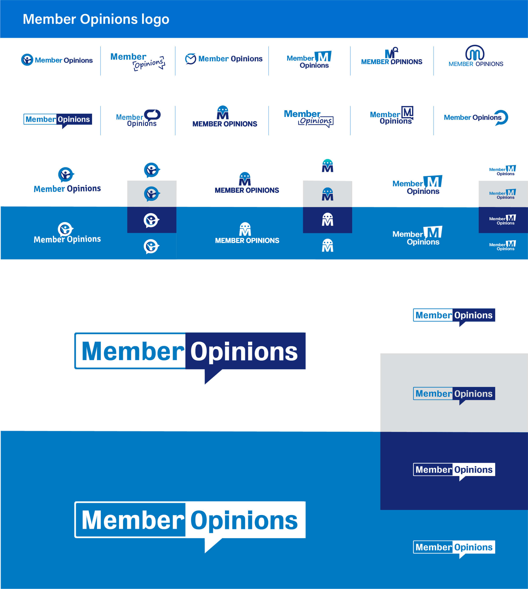
The brand name ‘Member Opinions’ was suggested by us and had the approval of AE. I created a range of ideas with pen & paper then draw them out on the computer for the team discussion. I then presented them to the American Express. In the end, they selected a logo that is closer to their branding, which the look & feel is more sophisticated.
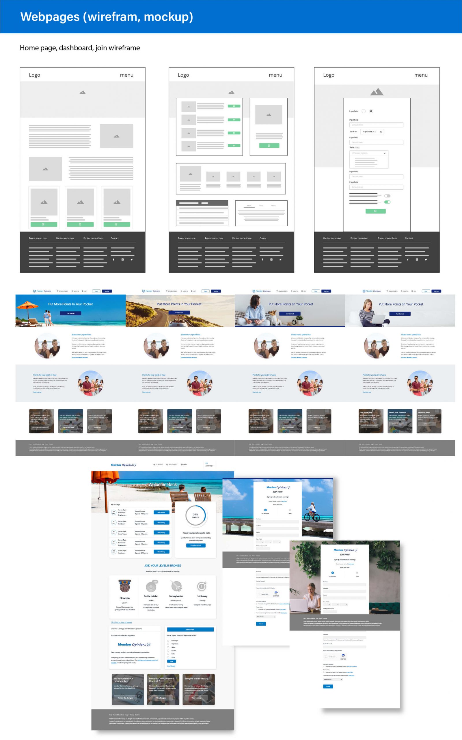
I suggested to the team to utilise some of the existing wireframes and layouts to develop this project. This is due to the whole project required for delivery within one and a half month.
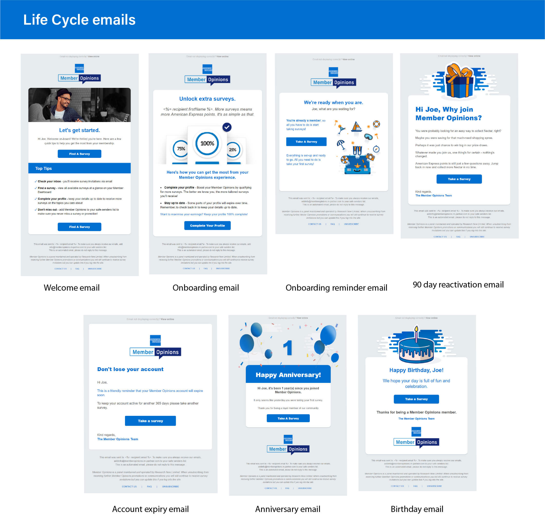
Life cycle emails are also part of this project scope. I created all emails mock-ups based on the branding and built the HTML then checked them all with an online email rendering tool ‘EmailonAcid‘ to ensure all emails are rendering great with different devices and online email clients.
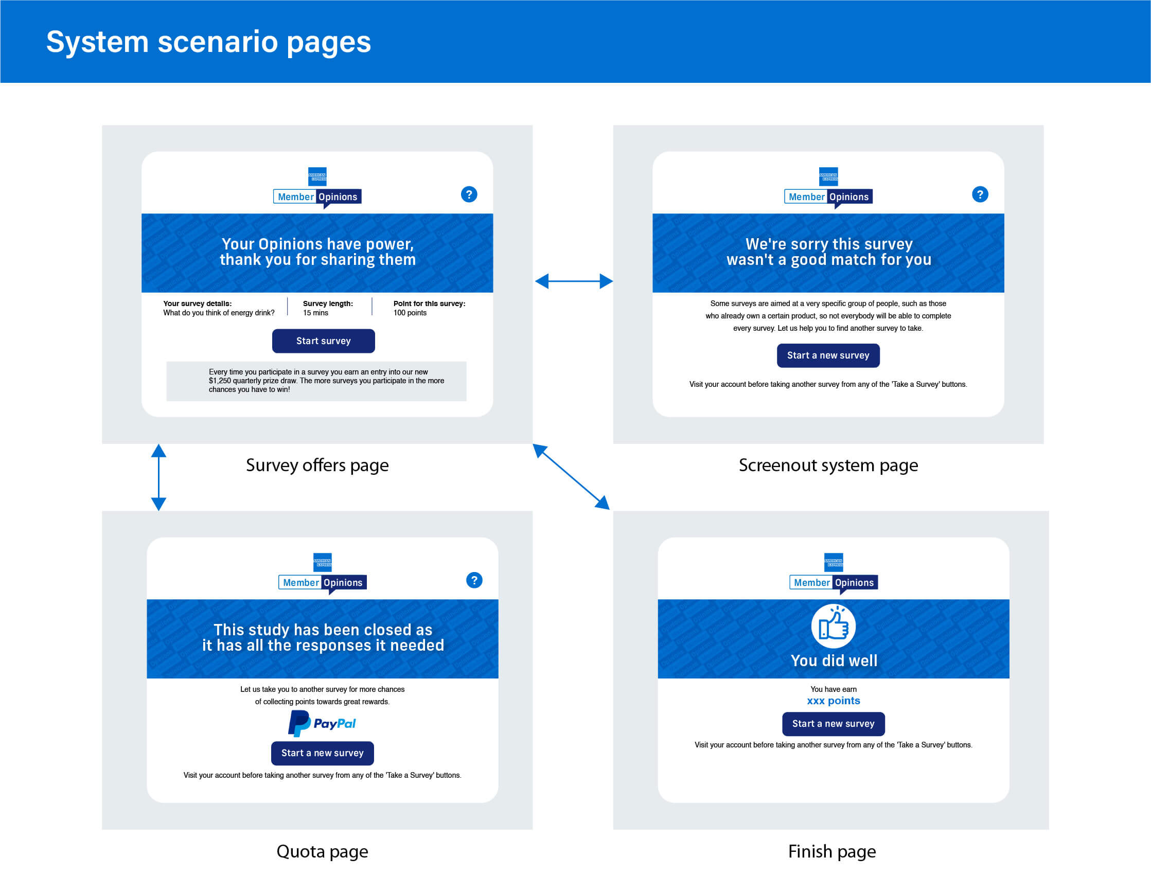
I would also need to create the below system pages mock-ups and built the HTML, modified JavaScript, and implemented them on the Dub Knowledge system (QA and Pro). Those pages show up when members engage surveys either from the life cycle emails or websites.
The project was a week delay as there was an issue with the American Express member login validation API in the production environment. However, this was working in the sandbox environment when AE signed off the project. In the end, our IT team worked out why AE members cannot use their ID to login, which is our login token return API is not compatible with the live AE database.
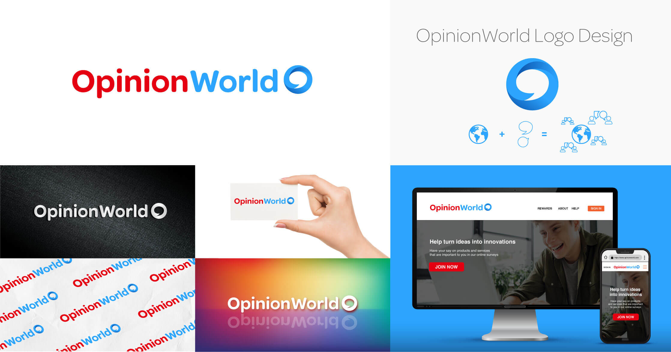
OpinionWorld is an online community for members to take surveys and express their points of view. In return, members can use their points to redeem gift cards, cash, and donate their points/money to charity.
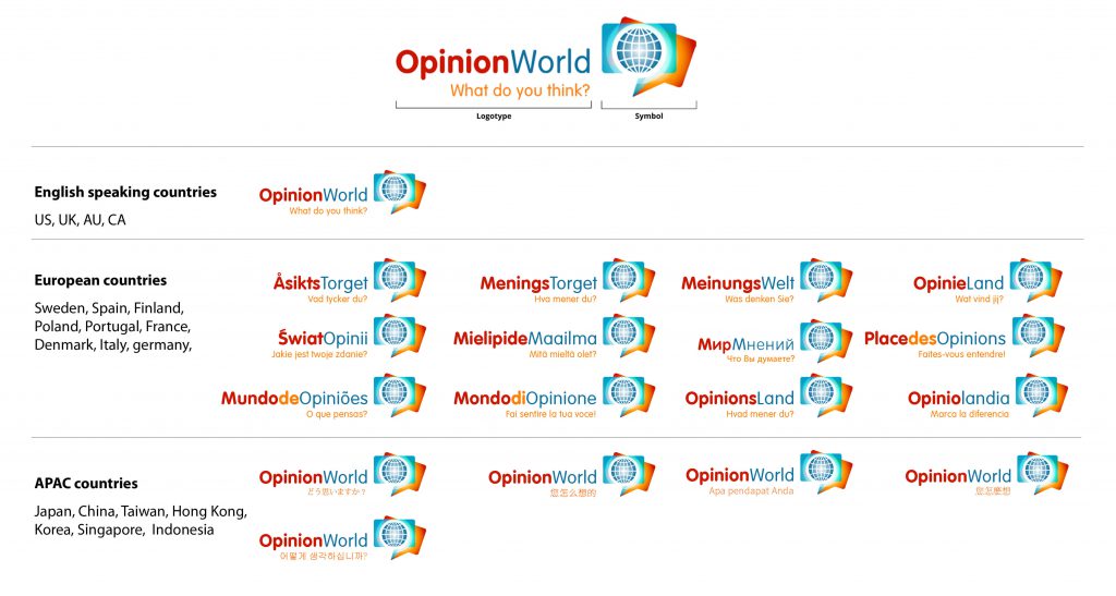
The logo was created in 2002 by a Dutch designer. It’s been in use for nearly two decades. The look and feel was quite dated so the company wanted to give it a fresh look.
I was the lead designer on this project and worked with a talented copywriter to refresh the branding while keeping the soul of the original design.
OpinionWorld is a global brand. The logo consists of a logotype and a symbol. It is used with 18 different languages. Local adaptation is a great way to resonate with the local target audience but it also generates a huge amount of work when the company needs to update/modify the digital products (content, banners, landing pages, EDMs, and etc…). Thus, moving forward I suggested using only English “OpinionWorld” that everyone can understand and to leave the logotype away.
I then applied an evolution approach to re-design this logo rather than starting new because the core focus of the business has not been changed.
I think it is critical to do some research to see how other companies use evolution design on their brands. This helps to understand better how brands evolve and adapt to an ever-changing world.

After the team agrees with the design approach, I work closely with the copywriter to create a new tone. It is a very important step in the project as this is the cornerstone of all digital assets
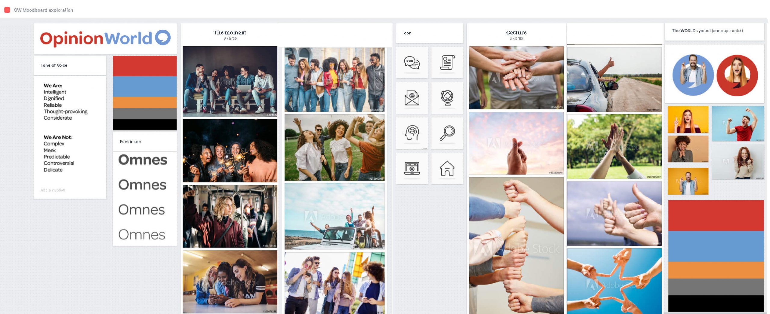
I have to say that this is the fun part of the project. Based on the tone of voice I sketch out many ideas…on papers. Who said work in an old fashion way is not efficient? This is the part where you can be free to create, make mistakes too.

Some selected sketches are now developed on the computer to see how they look on the big screen. This is the screening part.

So far in the process, it has rather been a solitary job. It is now time to discuss the ideas I generated with the wider teams and collect feedback. At this step, I often create and use a mood-board to further explore the branding ideas.
After a few rounds of discussion. The team generally select few ideas (we had 3 logos left at that stage for opinion world) to further develop.

The senior management team selected two final logos. They had a dilemma on which one to pick. Thus, I requested to work on the logos a bit more than present to them again.
The senior management team then selects the final contenders. At this step, it is sometimes difficult for the client to decide on the final choice as this is a big decision, the revamped branding will be used for many years. For instance, with OpinionWorld, they could not decide between 2 logos. We must give time to time. I take feedback from the company, analyse why they cannot choose, what they like in each logo, and use all this information to finely tune the last proposals.
For example, I think it is always a good idea to show a new logo on different backgrounds and materials. This would help me and others to visualise how the logo looks on the actual environment. In the end, the senior management team is generally able to pick the winning logo
